Heat Map
Heat Map
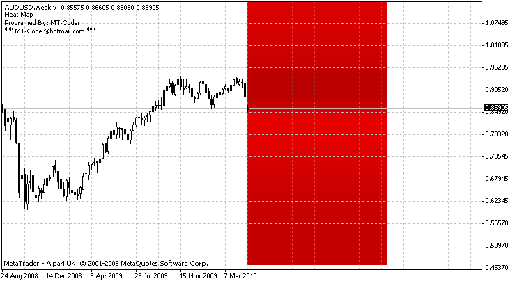
The purpose of this indicator is to highlight the price zones that had the most activity: the hottest zones.
The indicator shows a gradient of zones coloured in red.
It goes from bright Red ‘coldest’ to Dark Red ‘hottest’. THE DARKER THE HOTTER.
SETTINGS
HMPeriod : the number of bars included in the count
Scale : the size of each zone.
NbZone : the number of zones (rectangles) to create.
If all you get is a blue rectangle then check the availibility of history data for the period you’ve set, or just change the period.